Metal type and linocuts
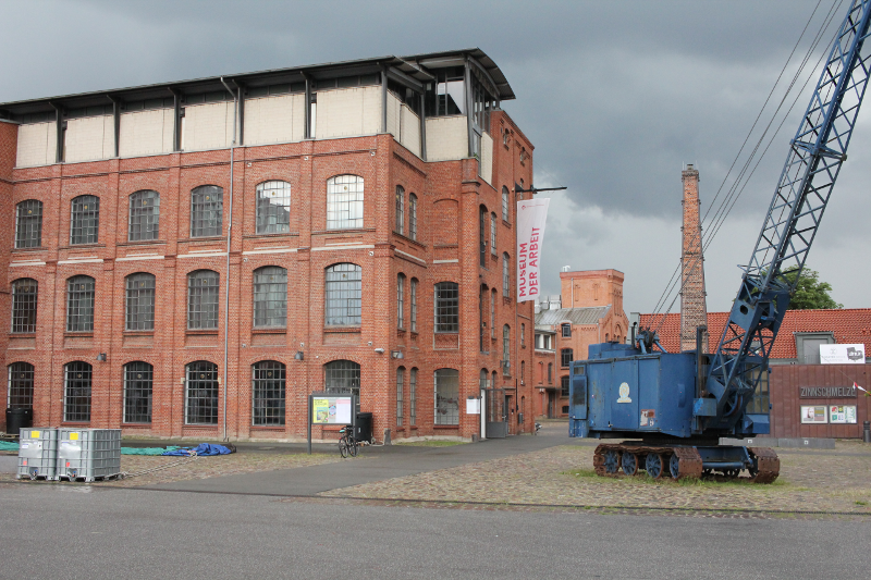
I participated in an enjoyable workshop on letterpress printing and typesetting with metal type in the Museum of Work, on a weekend in june. One of the perks of this is that, I'm "entitled" to visit the open workshop (normal entrance fees apply).
So most mondays I find myself visiting the museum, either typesetting or printing something.
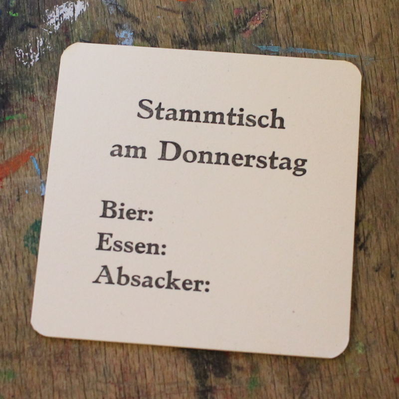
For one of my meetups/regulars table I did print coasters. The front page contains the title "Donnerstags Stammtisch" and fields to enter your consumption of beer, food and shots.
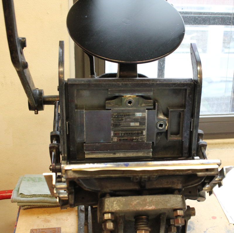

The front is set in 20pt (22pt for the head) Grenzsch Antiqua. The text was set to 16 Cicero width and 16 Cicero height. Together with the line spacing, this means that the beer field ends up just in the middle of the coaster. You have to raise the beer glass from the coaster to enter you consumption, hence it's a little bit unergonomic.
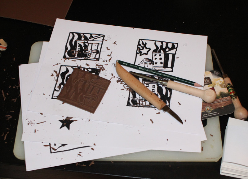
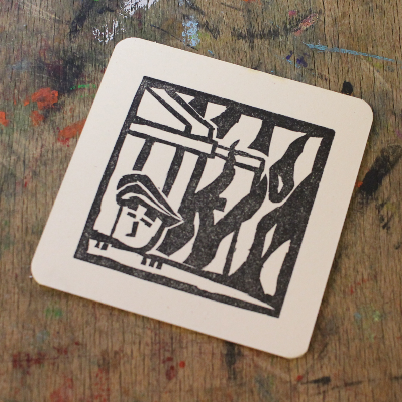
The back page contains a linocut of a certain Kilroy, burning down the White House. I didn't do linocutting for 20 years. Part of the challenge were tools that were blunt and a lack of proper lighting. So I cut the entire picture with just a knife and a flashlight leaning across it.
I remembered a lot of lessons from school, I did linocutting 20 years ago. Since you're working with a subtractive technique, you can't just overdraw lines, you will have to remove the non-printing parts.
Though remembering a lot, I still have a hard time controlling my tools, to get the desired results. Next week I'll get proper tools, sharpen them and get some light in place.
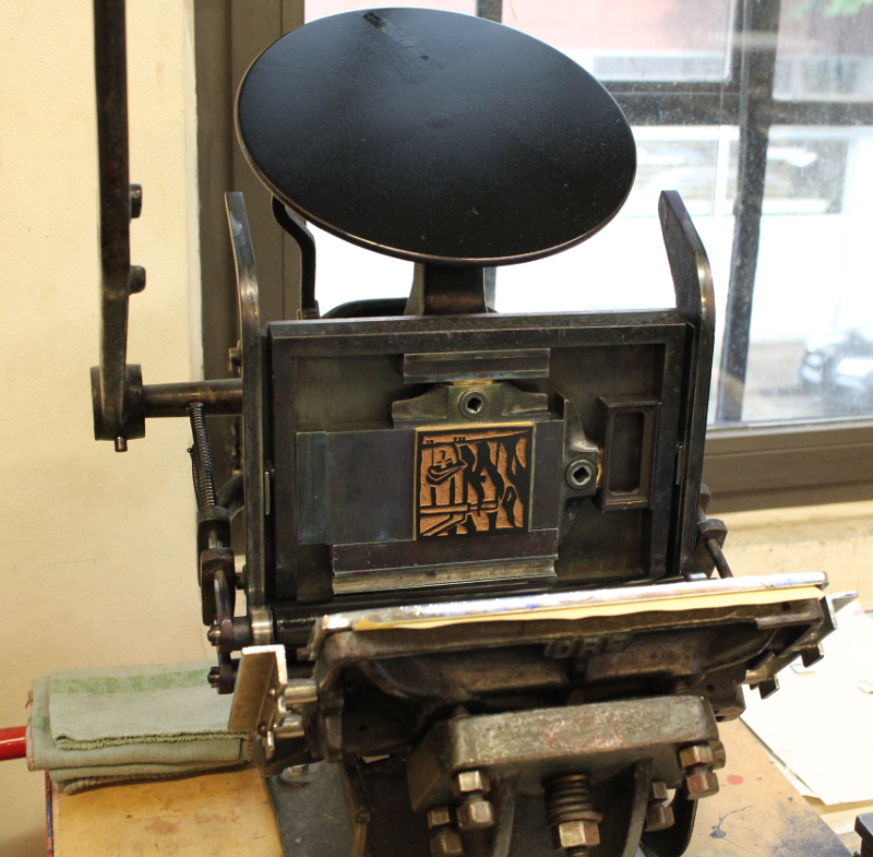
The printing of the linocut went very well, the print came out much better than I had hoped.
The weather was rather mixed, but I did not visit to sit outside and smoke. Next time a visit to the Café will nevertheless be appreciated.
